
A shocking statistic reveals that 34% of mobile eCommerce sites lack thematic product browsing, leaving users struggling to find products. The numbers get worse – your Shopify conversion rate drops 0.3% with each extra second of page load time.
Faceted navigation SEO statistics tell a compelling story: your site’s navigation directly affects your revenue. Your mega menus, filters, and facets need careful technical SEO optimization based on customer interaction patterns. The challenge seems widespread as 52% of desktop sites struggle to balance usability and performance effectively.
Mega menus done right help customers find products faster and explore your site more deeply. This leads to better conversion rates. But implementing these navigation elements without proper SEO planning can create major issues. Google’s latest search algorithm update ranks pages based on visitor satisfaction. This makes your navigation strategy crucial for success.
Here, we will show you proven ways to optimize your eCommerce navigation while boosting search performance. You’ll learn everything from faceted search best practices to mega menu SEO techniques that both users and search engines will appreciate.
Understanding Mega Menus, Filters, and Facets
A successful eCommerce site needs good navigation. Studies show mega menus can cut the clicks needed to find content by up to 50%. This makes the customer’s experience much better. These powerful navigation tools work together to create smooth shopping experiences.
What Is A Mega Menu In Ecommerce?
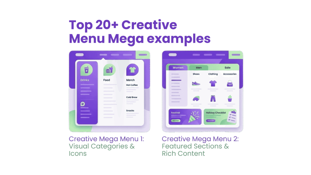
A mega menu is a two-dimensional dropdown panel that shows multiple categories and subcategories at once in a well-structured visual format. Traditional dropdown menus show just one group of links. Mega menus give you a complete view of your site’s navigation options in one place.
Mega menus stand out because they have these features:
- Large, two-dimensional panels with clear groups of navigation options
- Content laid out with proper typography and sometimes icons
- All options visible without scrolling
- Response to hover, click, or tap actions
- Display options in vertical, horizontal, or tabbed formats
Mega menus make your site architecture simpler by showing multiple categories and subcategories in one layout. This helps eCommerce stores with large product catalogs. Your customers can find relevant sections faster, which boosts conversion rates.
How Filters And Facets Differ
People often mix up filters and facets, but they serve different yet complementary roles in your eCommerce navigation strategy. This difference matters a lot when you implement faceted navigation SEO.
Filters are broad, static categories that sort content by excluding items that don’t match certain criteria. They stay the same, whatever the search context, and are the foundations of narrowing down options. Think of filters as your customer’s first step in finding products—they’re the basic categories like “Women’s Shoes” or “Kitchen Appliances” that start the product search.
Facets take a more dynamic approach to refining search results. They:
- Adjust based on each search query
- Work only with returned search results
- Let users pick multiple options across different features
- Show only options that fit the current context
Faceted navigation gives you multiple filters for different parts of your content. This creates a flexible system that works well with very large product catalogs. For technical SEO for eCommerce, knowing this difference helps you build navigation that serves both users and search engines.
Why These Elements Matter For UX and SEO
Good mega menus and faceted search best practices help both user experience and search engine optimization substantially.
Users benefit because good navigation reduces the mental effort needed to find products. Nielsen Norman Group research shows that well-designed mega menus help users grasp your site’s content quickly. This puts less strain on short-term memory. On top of that, faceted navigation makes decisions easier. Shoppers can quickly narrow thousands of products down to a few relevant ones.
Faceted navigation SEO creates opportunities and challenges. Good mega menus help search engines understand your website’s structure by showing clear relationships between different site sections. Search engines can index and crawl your pages better.
Poor faceted navigation can cause systemic SEO problems like duplicate content and crawl traps. Search engine bots might find similar content with different URLs. This creates keyword cannibalization and weakens ranking signals. You’ll need careful use of canonical tags and smart indexing decisions to fix these issues.
The key to eCommerce success lies in balancing user navigation needs with search engine requirements through optimized mega menus, filters, and facets.
Designing Effective Mega Menus
A mega menu’s success depends on smart design choices that balance looks, usability, and technical needs. Studies show that a well-laid-out mega menu makes it easier for users to find products. This directly affects your conversion rates.
Use Of Hierarchy And Visual Grouping
The foundation of great mega menus starts with logical grouping. Your menu should reflect how users think about their problems, not your company’s internal structure. This intuitive approach reduces friction and makes navigation smooth.
Visual hierarchy helps guide users through menu options naturally. You can achieve this through:
- Different sizing, font weights, and spacing to distinguish primary categories from secondary options
- Clear section headers to label groups distinctly
- Smart color contrasts that highlight key elements without overwhelming users
Icons and visual cues can help improve recognition and scanning speed. They work best when they actually help explain categories. Skip decorative icons that just add clutter. Stay consistent – either use icons everywhere or nowhere at all.
Best Practices For Desktop Vs Mobile
Modern mega menus need a mobile-first design approach. Start with small screens and build up the desktop experience, rather than creating two separate versions. Mobile devices work best with accordion-style menus or hamburger buttons that expand into full-screen navigation.
Desktop mega menus should show multiple levels of your site structure at once. Users save time because they don’t need to scroll as much. This gives shoppers a clear view of your site’s organization and helps them find specific content quickly.
The experience should feel familiar across all devices. Top ecommerce sites consistently show that “Mobile-first design (not just responsive)” leads to success. Your mega menu needs to work smoothly on all screen sizes.
Avoiding Cognitive Overload
Users feel overwhelmed when faced with too many choices or complex navigation. More options don’t always mean better navigation – they often make decisions harder.
You can curb this by:
- Keeping top-level categories between 5-7 options
- Using mega menu space to show main paths, not your entire sitemap
- Creating groups that aren’t too broad or too specific
- Adding clear borders between menu sections
Good planning prevents cognitive overload. Map out your site structure first to make sure it can grow naturally. The information architecture should shape your menu design, not the other way around.
Mega Menu SEO Considerations
Mega menus create both opportunities and challenges for your site’s SEO. A thoughtful design helps search engines understand how your website fits together.
Too many links can hurt your SEO value. A mega menu packed with links tells search engines every page matters equally. This makes it hard to highlight your most important content. One website put 250 links in its mega menu and saw key pages rank below less important ones.
Here’s how to optimize your mega menu for faceted navigation SEO:
- Use proper HTML5 markup with nav elements to help search crawlers find navigation content
- Limit links to keep your site hierarchy clear
- Make sure it works on mobile, since Google ranks mobile-friendly sites higher
- Watch your page speed – big mega menus can slow things down and hurt technical SEO for ecommerce
A balanced approach to these design principles and faceted search best practices creates mega menus that work well for both users and search engines.
Optimizing Filters for Product Discovery
Research shows that visitors who use filters are 52% more likely to convert than those who don’t. A good product filter works just like a knowledgeable sales associate – it guides customers straight to what they want without any hassle. Your filtering system needs to work perfectly if you run an ecommerce site with a large catalog, both to help users and support faceted navigation SEO.
Faceted Search Best Practices
The key to great faceted search lies in understanding how customers actually shop. We focused on matching filters to what drives real-life purchasing decisions in each category. Electronics shoppers care most about brand, price, and technical features, while fashion buyers look first at size, color, and fit.
Here are the best ways to set up faceted search:
- Use category-specific filters – Baymard Institute found that shoppers leave websites when they can’t find specific filter options. Using the same generic filters for everything creates more confusion than help.
- Display filters prominently – 43% of online shoppers head straight to filters before looking at products. Make them easy to spot – usually in a left sidebar on desktop and a sticky or expandable bar on mobile.
- Enable multi-select filtering – Most users (64%) want to pick multiple filter values, especially for fashion and home décor. Let customers select several options within one attribute, like multiple colors or brands.
- Implement interactive filtering – Results should update right away when filters change, without reloading the page. This makes browsing smooth and keeps users from losing their place, which matters even more on mobile.
How To Structure Filters By Attributes
Good filter structure starts with proper data preparation. Start by gathering complete product data that’s clean and ready to create useful facets. Store each attribute in its own field to make it easy to build things like size charts, brand lists, and specifications.
Here’s how to organize your filters effectively:
- Prioritize by relevance – Put the most-used filters at the top. Check your analytics to see which filters customers use most often for specific searches.
- Implement contextual filtering – Your search should figure out what each query needs and show only relevant filters. A search for “laptop” should show different options than one for “washing machine”.
- Show numerical indicators – Let shoppers see how many products match each filter option. This helps set expectations and stops the frustration of finding no results.
- Structure thematic filters – Add filters that go beyond basic features, like “Occasion” (Wedding, Casual, Vacation) or “For winter” to help people find products based on how they’ll use them.
Common Filter Ux Mistakes To Avoid
Filter implementation often falls short on many ecommerce sites. Baymard Institute discovered that only 16% of websites offer a good filtering experience. Here are the mistakes you should avoid:
Displaying empty results – Shoppers hate selecting filters only to find zero matching products. Either hide filter options that lead nowhere or show them grayed out.
Page reloads for every filter change – This breaks the shopping flow, especially on slower mobile connections. Utilize AJAX filtering to maintain smooth operation.
Hiding applied filters – Show which filters are active clearly and make them easy to remove one by one or all at once. This keeps shoppers from getting stuck with filters they didn’t mean to use.
Overwhelming with too many options – The Goldilocks rule works best for filter displays—not too many, not too few. For big categories like colors, show popular choices first with a “View More” option.
Ignoring mobile users – Mobile makes up over 70% of ecommerce traffic, but many sites still don’t optimize filters for phones. Think about using full-screen or slide-over filter displays for mobile shoppers.
A well-designed faceted navigation SEO system that follows these guidelines will boost user experience and support your technical SEO for ecommerce goals.
Faceted Navigation And SEO Risks
Faceted navigation creates serious SEO challenges that can undermine your eCommerce site’s performance without proper management. Each filter combination generates unique URLs, and a modest product catalog quickly expands into thousands of pages with similar content. This technical complexity needs careful handling to maintain search visibility.
Duplicate Content And Crawl Traps
Faceted navigation produces multiple paths to similar content, which creates duplicate pages and confuses search engines. To name just one example, see how accessing women’s white t-shirts might happen through six different URL structures (e.g., /womens/v-neck/bench or /bench/womens/v-neck). Search engines must guess which version deserves priority, and they might choose less relevant pages.
There’s another reason facets can be problematic – they generate exponential URL growth, creating “crawl traps.” Search engines allocate limited resources (crawl budget) to each site, and excessive facet combinations waste this budget on low-value pages. This becomes especially problematic when you have websites with over 10,000 frequently changing pages. So search engines might miss your most important pages while crawling these unnecessary variations.
Using Canonical Tags And Noindex
To curb duplicate content issues, implementing canonical tags becomes essential for faceted navigation SEO. These HTML elements tell search engines which version of similar pages should receive ranking priority. Self-referencing canonicals work best for pages you want indexed, while variations should point back to parent categories.
Using noindex tags for less valuable filter combinations offers another quick way forward. This strategy lets search engines crawl these pages (preserving internal link equity) while keeping them out of search results. To cite an instance, pages with multiple color selections (blue_black) might receive noindex directives while single color pages remain indexable.
Note that these methods work best with systematic application. Your URLs should fall into three clear groups:
- Index: Valuable combinations with self-referencing canonicals
- Noindex: Less useful combinations that shouldn’t compete in search
- Block crawling: Low-value pages blocked via robots.txt
Faceted Navigation Seo Strategies
Technical SEO for ecommerce requires an integrated approach to faceted navigation. Beyond canonicals and noindex directives, think over these strategies:
Robots.txt helps block parameter-based filters that add no search value. This reduces crawl budget waste and preserves server resources. Parameters like sort options or session IDs rarely need indexing.
Your URL structures must stay consistent. Encoding filters in URL paths (/products/fish/green/tiny) needs a logical order, and duplicate filters cannot exist. This stops unnecessary URL variations from appearing.
Serve appropriate HTTP status codes – use 404 errors for filter combinations that return no results instead of empty pages. This keeps search engines from wasting resources on invalid combinations.
Looking to implement these strategies? Our on-page SEO services can optimize your faceted navigation structure to maintain both search visibility and user experience.
Mobile Navigation Considerations
Mobile devices generate over 70% of eCommerce traffic. Your conversion rates depend on how well you optimize mobile navigation. Mobile interfaces need a different approach than desktop ones because of their smaller screens. This helps maintain strong faceted navigation SEO and gives users a smooth experience.
Sticky Menus And Collapsible Filters
Users move around 22% faster with sticky menus, according to recent studies. They don’t need to scroll back to the top of long pages anymore. Your eCommerce site should keep search, cart, and main navigation options always available.
“When such a page features a sticky header, visitors can find their way around more easily”. The space these sticky elements take up could show more products instead. That’s why your sticky headers should stay slim and practical rather than decorative.
Collapsible filters play a vital role in mobile faceted search best practices. Here’s how to handle filters:
- Place them where users can reach them easily (usually at the screen bottom)
- Make them expand with clear visual hints
- Keep them sticky while users browse products
Touch-Friendly Design And Spacing
Mouse and touch navigation work differently. Your mobile site’s tap targets need to be at least 1cm × 1cm, with 16pt text size for easy reading. This stops users from leaving your technical SEO for ecommerce optimized pages because of frustrating tap errors.
Thumb zones matter for important elements. Young mobile users prefer one-handed navigation 61% of the time. The lower half of the screen works best for important buttons like “Buy Now.
Interactive elements need 32 pixels of space between them horizontally and vertically. This spacing helps users tap the right buttons and makes navigation more accurate.
Using Icons And Banners For Navigation
Icons can replace text in mobile navigation, but only if everyone understands what they mean. Standard functions like search, share, and settings work fine with just icons in headers. Main navigation items need clear labels to avoid confusion.
Bottom tab bars work great for features people use often. UX researchers point out that “Tab bars are persistent, that is, they are always visible on the screen, whether the user scrolls down the page or not”. These bars make perfect sense for your key navigation elements.
Every tap needs clear feedback. Your faceted navigation SEO optimized site should show color shifts, subtle movements, or font changes to confirm user choices.
Testing and Personalizing Navigation
Navigation elements need continuous measurement and refinement to boost conversions. Your navigation system needs data-informed improvements to achieve faceted navigation SEO success.
A/B Testing Mega Menu Layouts
Systematic testing turns guesswork into solid decisions. Your specific product offerings determine whether horizontal or mega menus work better. Horizontal menus show better results for businesses with limited product catalogs. Test results should be archived since 40% of conversion rate optimization testers keep records to reference later.
Personalizing Filters Based On User Behavior
Filters customized to individual shopping patterns make purchases smoother. User-affinity strategies that highlight relevant filters for each visitor reduce discovery time by a lot. This tailored approach helps customers make better-than-standard filter presentations.
Tracking Navigation Performance With Analytics
Navigation effectiveness measurements reveal hidden optimization opportunities. Google Tag Manager tags that track pages with the most navigation interactions give practical insights. Custom reports analyze this data and uncover trends that shape navigation improvements.
Regular testing and personalization of your technical SEO for ecommerce navigation elements create an experience that adapts to user needs while keeping strong search visibility. RankFast‘s on-page SEO services can optimize your navigation for both users and search engines if you need help with these strategies.
Conclusion
This piece shows how these elements affect both user experience and search engine visibility. Users who interact with well-designed filters are 52% more likely to convert. Poorly implemented faceted navigation can create severe SEO problems like duplicate content and wasted crawl budget.
Your eCommerce performance depends on balancing technical requirements with usability needs. Mega-menus flatten site architecture and help customers find products faster when properly implemented. Smart use of canonical tags and noindex directives protects your search rankings. Mobile-optimized navigation with proper touch targets and sticky menus can substantially reduce friction for the 70% of shoppers using smartphones.
These navigation elements might seem complex to implement, but their effect on business makes the effort worthwhile. Every second saved in page loading time and every improvement in navigation clarity leads to higher conversion rates and increased revenue. Up-to-the-minute data analysis and A/B testing help your navigation system evolve with customer needs.
RankFast’s on-page SEO services and bigcommerce seo company can help you optimize your eCommerce navigation for users and search engines. We focus on increasing conversions while maintaining strong search visibility. Without doubt, your eCommerce success depends on these navigation elements—optimize them today and watch your performance metrics grow.
FAQs
What is eCommerce optimization, and why is it important?
eCommerce optimization is the ongoing process of improving website design, marketing strategies, navigation, and conversion funnels to enhance the shopping experience and boost customer engagement, conversion rates, and sales. It's crucial for staying competitive and maximizing revenue in online retail.
Are mega menus beneficial for SEO?
While mega menus can improve user experience by providing easy access to multiple categories, they may negatively impact SEO if not implemented correctly. Mega menus can potentially disrupt hierarchical URL structures, which could affect your website's Google rankings. Careful implementation is key to balancing usability and SEO benefits.
How can I optimize my eCommerce site's navigation menu?
To optimize your navigation menu, focus on improving site taxonomy, structuring pages logically, and labeling menus clearly on both desktop and mobile. Implement a user-friendly hierarchy, use descriptive labels, and ensure easy access to important pages. Regular testing and analysis can help refine the navigation for a better user experience and search engine visibility.
What role do filters and facets play in eCommerce navigation?
Filters and facets are crucial for product discovery in eCommerce. They allow users to narrow down product selections based on specific attributes, improving the shopping experience. Well-implemented filters can increase conversion rates by up to 52%. However, it's important to balance user-friendliness with SEO considerations to avoid issues like duplicate content or crawl inefficiencies.